Some bits of my current work. Relatively recent development of superresolution technique provided tools to see the shape and sub-structure of cells in much more details. Here is example: live image of HeLa cells labelled with membrane fluorescent marker (mEos) in regular widefield (top-left half) and in superresolution (SR) reconstruction:
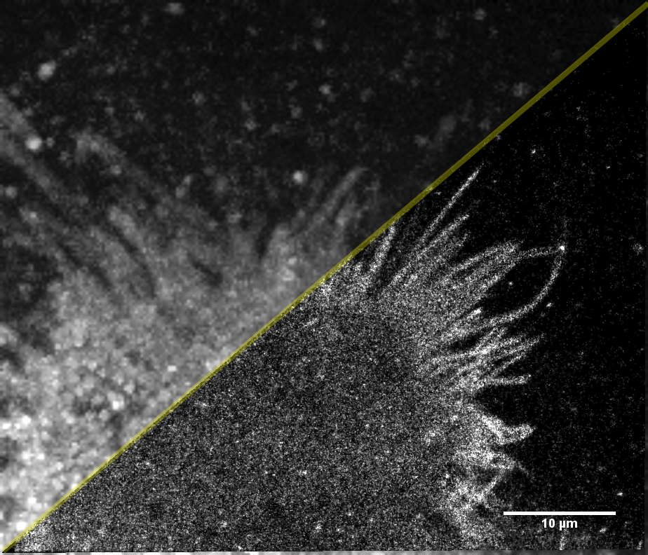
Click on the picture to see full size image.
There is quite a difference, especially in the contrast of thin filopodia, those characteristic protrusions of HeLa cell’s emanating on the border. Superresolution image is just a cumulative map of individual positions of molecules at different times, diffusing along the cell’s membrane. So it is kind of “molecule density map”.
Apart from shape, even more interesting questions are the dynamics of cell, active and passive processes. One way to get some insight (since it is live) is to track each molecule and characterize its speed. The speed of particle at each moment can be color-coded (blue is slow and red is fast) and resulting image gives totally different dynamic portrait of cell:
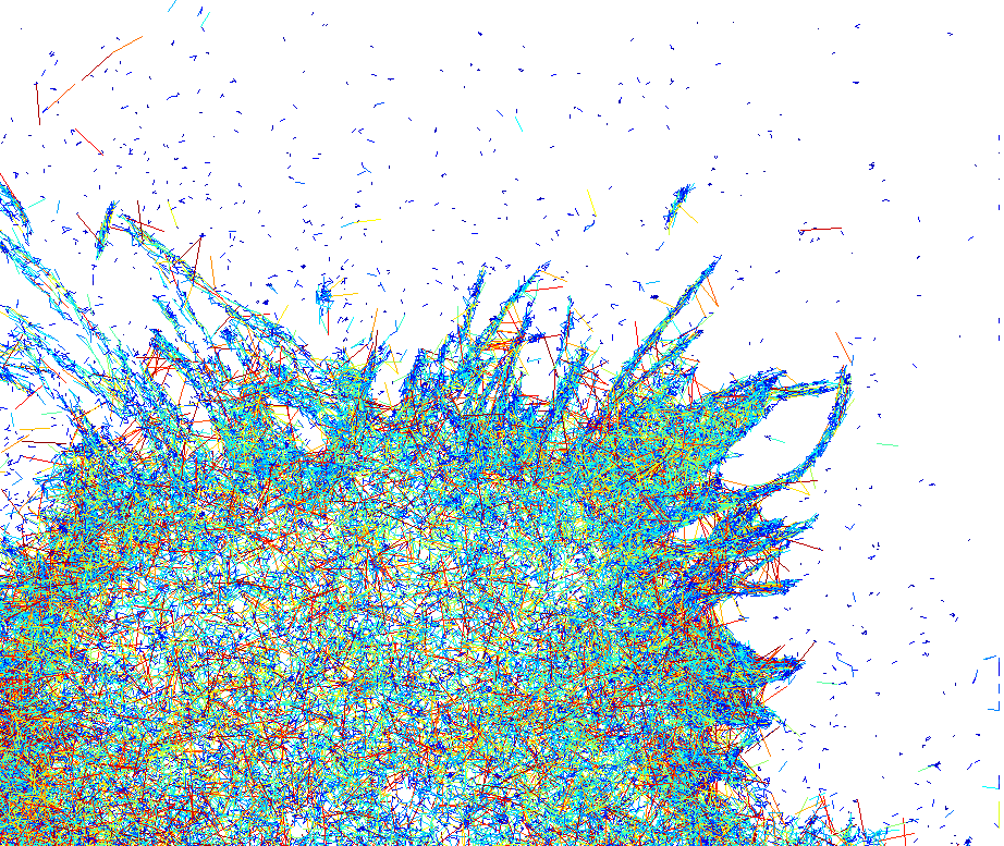
Click to see full size
This is quite common technique to represent trajectories, but if there are a lot of them (and it is about 24000 here) in a confined space, tracks are drawn on the top of each other and this makes observation of the whole picture/pattern (what is going on?) quite difficult.
An alternative to this approach is to build a “map” of speeds. At each small area (pixel) the speeds of passing by particles can be averaged and resulted mean value plotted as intensity. If in some area particles are slowing down, the intensity (brightness) will be small, if they are accelerating, it would be bright. In this sense one can highlight “slow” and “fast” areas inside the cell, independent on the behaviour of individual particles/trajectories. Here is resulting map:
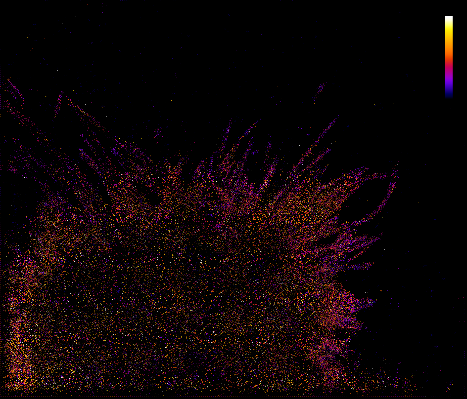
click to see full size
Intensity is coded with different colors here (see color bar): the “fast” areas are yellow and white, “slower” areas are in red and the “slowest” are in purple/darkblue.
From this map it is quite obvious that molecules on the membrane are slowing down at filopodia (purple colored). Actually, now this can be noted also at the previous picture, filopodia’s color is mostly blue. Probably, this speed reduction happens due to the shape confinement. A particle entering filopodia is facing narrow backstreet with “dead end” and comparing to a particle within the cell body, confined in movements and “jumps” it can make during a period of time. So filopodias are great “traps” for membrane molecules.
In that way different angles of looking at single molecule behaviour can tell something about biological functions and features.
0 Comments